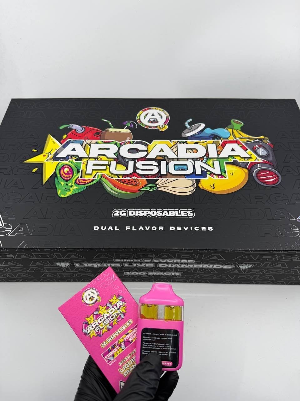

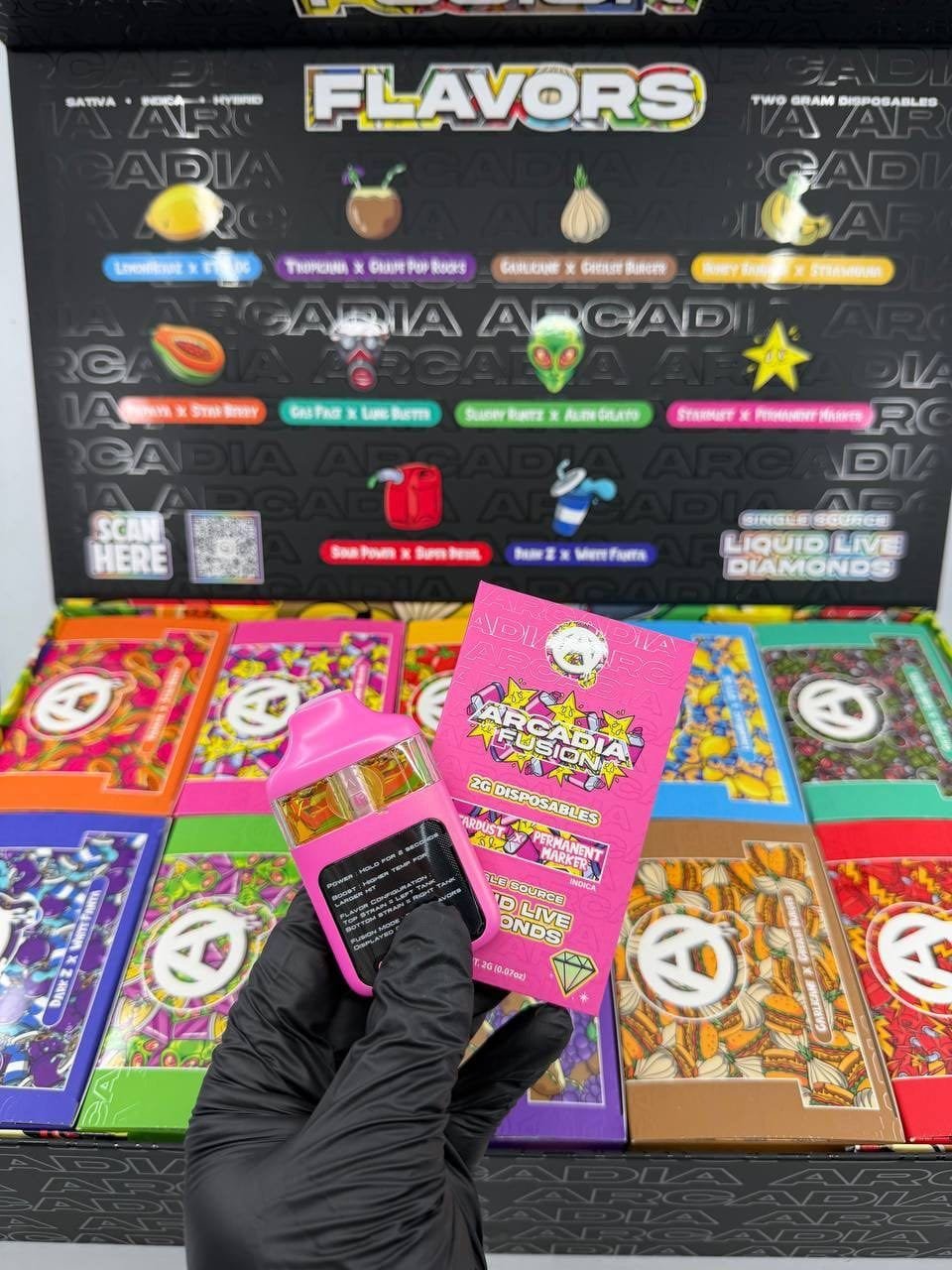
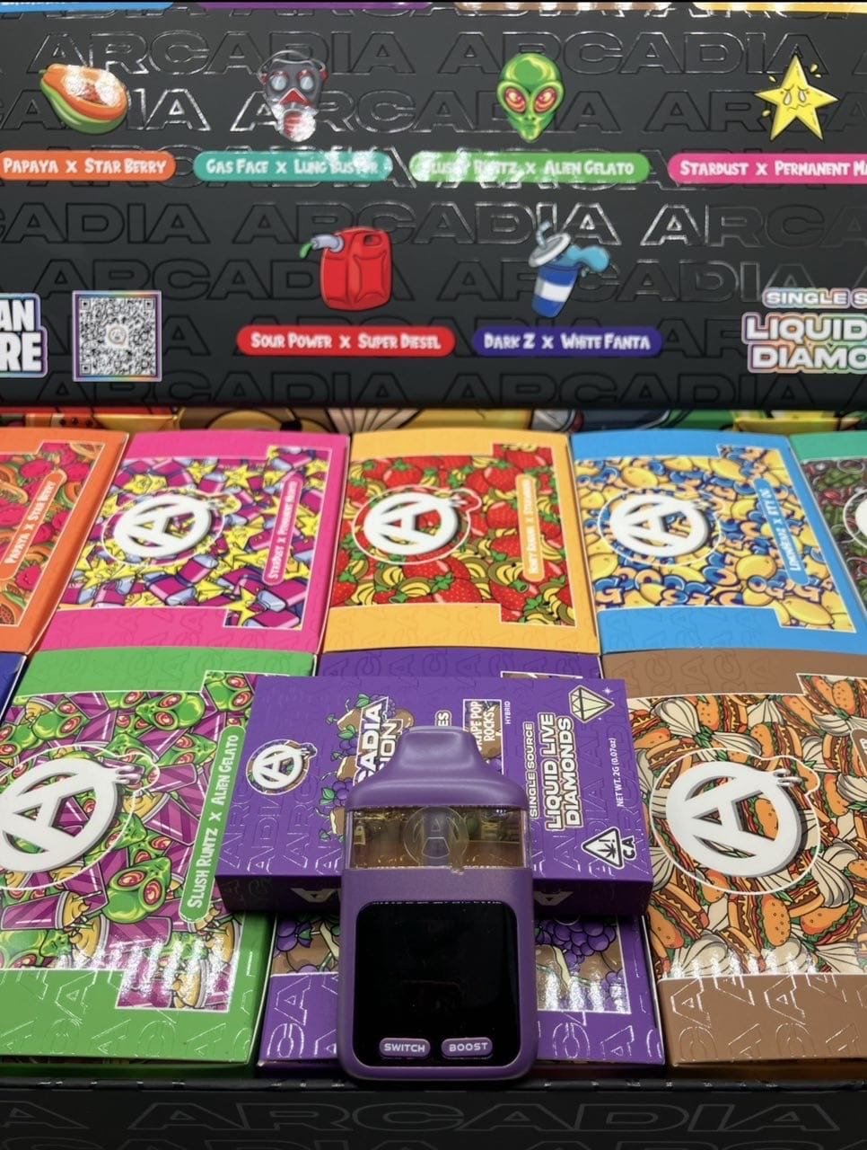
ARCADIA FUSION 2G DISPOSABLES
Description
Seamless Fusion Identity and Sculpted Minimalist Architecture
The Arcadia Fusion 2G Disposables – Futuristic Minimal Luxury Edition are built around fluid precision. Where many packaging systems rely on graphic complexity or aggressive contrast, this edition emphasizes composure. Therefore, its identity emerges from controlled surfaces, negative space, and sculpted proportion.
Matte Surface Language as Foundation
The defining feature of the Arcadia Fusion Edition is its matte surface discipline.
Soft-touch coatings cover the primary panel, reducing glare under retail lighting. Because light diffusion remains even, gradient fusion lines appear subtle yet visible.
Subtle gradients create movement without distraction.
Movement enhances visual interest.
Interest strengthens shelf engagement.
Diagonal Fusion Line Mapping
A gentle diagonal line sweeps across the front panel.
This line represents convergence — the merging of design, material, and silhouette. It remains faint and tonal rather than heavily contrasted.
Because the line follows a precise proportional ratio, visual balance remains intact.
Balanced composition elevates premium perception.
Premium perception reinforces brand authority.
Centered Geometric Wordmark
The ARCADIA wordmark appears centered with generous negative space.
Typography uses clean, geometric sans-serif forms. Kerning remains consistent and moderate. Supporting “Fusion” text appears in lighter weight beneath the primary mark.
Clear hierarchy prevents clutter.
Clarity improves recognition.
Recognition supports long-term equity.
Controlled “2G” Integration
The “2G” marking integrates within the lower third of the panel.
Rather than dominating, it complements the overall design language. Its scale remains proportionate to the wordmark above.
Proportional restraint strengthens compositional discipline.
Discipline communicates confidence.
Sculpted Device Silhouette
The casing exterior mirrors the packaging’s seamless identity.
Edges appear gently rounded yet defined. Surface transitions flow without abrupt interruption. Matte finishes maintain tonal consistency with the outer box.
Because casing and packaging share silhouette harmony, cohesion remains strong.
Cohesion enhances perceived craftsmanship.
Craftsmanship elevates prestige.
Structured Opening and Interior Presentation
The packaging may incorporate a magnetic lid or precision slide mechanism.
Opening motion remains smooth and balanced. Interior cavities align symmetrically to cradle the device upright.
Interior lining mirrors matte exterior tones.
Symmetrical presentation reinforces composure.
Composure supports luxury positioning.
Compliance Integration Within Minimal Grid
Compliance information integrates within a rear grid layout.
Typography hierarchy remains clean and organized. QR codes align flush within designated lower zones.
Professional integration preserves wholesale credibility.
Credibility strengthens distribution partnerships.
Retail Shelf Presence Through Quiet Authority
In saturated retail environments, minimalism becomes differentiation.
When multiple Arcadia Fusion units align horizontally, matte planes form continuous soft bands across shelves.
These bands create visual calm within high-stimulation surroundings.
Calm draws focused attention.
Focused attention increases dwell time.
Collector Appeal Through Subtle Variants
Future releases may introduce alternate matte tones such as frost blue or muted clay.
However, silhouette proportions and fusion line mapping will remain unchanged.
Consistency compounds recognition.
Recognition builds legacy.
Seamless Precision as Strategic Framework
Ultimately, the Arcadia Fusion 2G Disposables – Futuristic Minimal Luxury Edition transform simplicity into structural infrastructure.
They leverage matte discipline, diagonal fusion mapping, geometric typography, and sculpted silhouette harmony. They integrate casing and packaging seamlessly. They command shelf presence through restraint.
Rather than relying on spectacle, they build power through proportion.
And in minimalist brand strategy, disciplined composition defines enduring relevance.
Related products
-
Sale!
NEW HITZ 2G DISPOSABLE INFINITY EDITION
Price range: $30.00 through $1,500.00Select options This product has multiple variants. The options may be chosen on the product page -
Sale!

FRYD 3G DISPOSABLE + FREE GUMMIES
Price range: $30.00 through $1,500.00Select options This product has multiple variants. The options may be chosen on the product page -
Sale!

LUIGI V6 2G DISPOSABLE LIVE RESIN LIQUID DIAMOND
Price range: $30.00 through $1,450.00Select options This product has multiple variants. The options may be chosen on the product page -
Sale!

WHOLE MELT EXTRACTS PHASE TWO 2G DISPOSABLE DUAL CHAMBER
Price range: $30.00 through $1,500.00Select options This product has multiple variants. The options may be chosen on the product page
Reviews
There are no reviews yet.